16/5/2022- 06/5/2022 / Week 8 - Week 10
Ravvetaran Thillai /
0346025
Typography / Bachelor of Mass Communications (Honors) (Advertising &
Brand Management)
Task 3A : Type Design & Communication
LECTURES:
Week 8 -Typo Task 3A Typeface Construction
During the lesson that took place this week, Mr. Vinod provided us with
a rundown of our Task 3 and demonstrated how to put together a typeface
by utilizing different shapes and strokes.

|
|
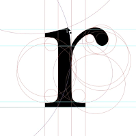
Figure 1.1 Deconstructed Letter 18/05/2022
|

|
|
Figure 1.2 Guidelines and anatomy of letters 18/05/2022
|
In addition, we were instructed to study at least three deconstructed
letters in order to better grasp how typefaces are created. As example,
this would allow us to see how the slightest alterations in strokes or
thickness affect the visual and technical aspects of our work.
INSTRUCTIONS
Task 3A : Type Design & Communication
We were given the task of designing a typeface for activity 3A. It is
essential that we conduct visual research before beginning anything else
because this helps us generate ideas and inspirations.
1. Visual Research

|
Figure 1.1 Exploration on Font Design (18th May 2022)
|
|
2. Deconstructed Fonts
 |
Figure 1.2 Serifa Std (18th May 2022)
|
 |
| Figure 1.2 Gill Sans (18th May 2022) |
3. Sketches
After doing some research on typefaces and gathering ideas, I started
sketching out potential typefaces.

|
Figure 2.0 Sketches (19th May 2022)
|
|

|
Figure 2.1 Sketches (19th May 2022)
|
|
I went with the sixth sketch after considering the comments that were
made, and Mr. Vinod suggested that I choose that particular typeface for
my project because he thought it looked great. After that, I proceeded
with the digitalization of my font in illustrator, and out of the 10
types that were available, I decided to use Univers LT Std Bold as my
reference. Because it looked similar when I was sketching it, it looks
like my sketch.
4. Digitalization
.png)
|
|
Figure 2.2 Guides using Univers LT Std (25/05/2022)
|
I used a typeface that I chose as a reference to come up with
guide lines to help me begin the process of making my own typeface. The
letters in the font Univers LT Std were used to make these guides
- Ascender height
- Capital height
- Mean/median line
- Baseline
- Descender line
- X-height

|
|
Figure 2.3 Process of constructing a letter (25/05/2022)
|

|
Figure 2.4 Letter that have been constructed with the guide lines
(25/05/2022)
|

|
|
Figure 2.5 Artboard (RAW) that contains the final design of
letter that haven't been merged yet (25/05/2022)
|

|
Figure 2.6 After using the 'Unite' in pathfinder (25/05/2022)
|
I made sure to give each letter the same amount of thickness so that it
would be proportional to its size. I intended to steer clear of having
my typeface's individual letters appear to have a unique appearance.
The comma, exclamation point, and dot all have to be tweaked based on
the feedback I received.

|
Figure 2.7 Before and after (30/05/2022)
|

|
|
Figure 2.8 Comparison between Univers LT Std and my digitalized
typface (30/05/2022)
|
5. Developing the final font in FontLab 7
I began exporting my letters to Font Lab when I finished digitising
them. FontLab had to be downloaded and pre-recorded tutorials watched
before I could even begin to learn how to use the software properly.

|
Figure 2.9 Copying and pasting the letters into FontLab 7
(30/05/2022)
|

|
Figure 2.10 Kerning letter (30/05/2022)
|
As shown in the demonstration video, after putting all of the letters into
FontLab7, I went to the metrics tab and did the specific kerning for each
glyph. I also completed the 'font info' page by entering the font
information and measurements (ascender, descender height, etc.).

|
Figure 2.11 All letters (30/05/2022)
|
After I had finished kerning my font, the next step was to export it
and then install it so that I could use it.

|
Figure 2.11 Final Font after installing (30/05/2022)
|
Font information:
Typeface : Stretchy Retro
Ascender height: 733
Descender height: -205
Line gap: 100
Caps height: 696
X-height: 500
Final Submission

|
|
Figure 2.12 Final Submission Poster in JPEG (30/05/2022)
|
Figure 2.13 Final Submission Poster in PDF (30/05/2022)
 |
Figure 2.14 Final Font Submission in JPEG (30/05/2022)
|
Feedback
Week 9 on Task 3
General Feedback : Sketch 5 looks much more better and neat.
Specific Feedback :
The 4th sketch is perplexed with the letter E and the 3 first sketches seem to
be in line with what is expected. He also added that these connections are not
useful and are particularly functional in design.
Week 10 on Task 3
General Feedback : Interesting typeface that looks both art deco
and modernized.
Specific Feedback : The exclamation
mark has to end earlier. The dots have to resize bigger. He also told me
that if the dots are small, they will not be seen later on.
Reflections
Experience:
The design process was a positive one for me. The situation becomes more difficult and alarming, however, when Fontlab enters the picture. As a result of pasting the font, I had a problem where some of the letters were not showing up. I was able to resolve the issue after going over the tutorials again and consulting with my lecturers. It was a huge relief to finally be able to put the problem to rest thanks to their help. Finally, the font was finished and ready to be used in a variety of settings.
My experience has shown me that designing a font or typeface requires a significant amount of time, as well as the ability to research, patience, and keen observational skills. It is not a simple procedure, and there are a great deal of specifics that need to be considered. But at the same time, the tiniest of details in letter design are significant, and no matter whatever design direction we are going in, we stick to one or two distinctive aspects in order to make it recognisable. I became aware of the significance of the difference between the stroke widths and the stem widths when I was sketching a variety of design ideas.
Findings:
This is one of my favourite tasks, despite the fact that it is extremely time-consuming and tough. Making my own typeface was a lot of fun. Also, I'm rather satisfied with my choice of font. In the course of the project, I learnt a great deal about myself and how much effort I needed to put in to succeed.
Further Readings:
 |
| Figure 3.1 Thinking with type (31th May 2022) |
The book "Thinking with Type," written by Ellen Lupton, is a helpful resource that teaches readers how to properly align and space letters and words, as well as how to shape and organise them. I was instructed in the principles of typography, including typefaces and type families, kerning and tracking, and the proper utilisation of grids.
In addition to that, I became familiar with metric and optical kerning. The usage of kerning tables that are already present in the typeface is what is meant by the term "metric kerning." The metric kerning feature of the page layout application represents the space that the type designer intended for the characters to have between them. It has a pleasing appearance, particularly when scaled down to a small size. By using optical kerning, we are able to examine the contours of each character and modify the spacing appropriately wherever it is required.
 |
| Figure 3.1 Healine Tracking (31th May 2022) |


.png)


Comments
Post a Comment