Name : Ravvetaran Thillai A/L Thillai Kumar
I.D : 0346025
Course: Bachelor of Mass Communication (Honours) (Advertising & Brand Management)
Week 7
LECTURE
Visual analysis is defined in this chapter as the understanding of a design that is focused on the specific aspects and principles of a particular design. The idea is to recognize the decisions taken by the designer(s) when designing those designs. The ability to perceive and understand the formal features of design that transmit ideas, context, or meaning can also be beneficial.
Phase 1: Observation
Observation is accomplished by taking a careful look at design inspirations and noting the visual aspects present in them. There was no need for additional investigation, and instead, we are simply pointing out what may be comprehended through a self-made explanation.
Phase 2: Analysis
The analysis has been done with a further breakdown and the development of our observations in a more detailed form. With the exact visual aspects that we have identified, we can describe what influence the elements have in the design. Explanations of the necessary design principles extracted can also be extended at this step, although not with any further research.
Phase 2: Interpretation
This step is a more extensive one because all our observations, descriptions, and analyses done in the previous stages were then backed up with some extra study to combine them with factual answers. This can be about the designer's background and historical context. Some criteria that we can follow when undergoing the interpretation phase include, for example, the meaning and goal of the design.
___________________________________________________________________________________
INSTRUCTIONS
We were all given two weeks to finish this assignment (Final Project), which necessitated the understanding of visual analysis on our part. In general, the project needs us to evaluate, study, document, and analyze a design material that can take the form of billboards, television ads, movie clips, or works of art, amongst other mediums. As a result of our research and observations, we should be able to detect the specifics of these instances, such as their size and placement, their purpose, their efficacy, and their design principles. This helps us to gain inspiration while also observing and extracting information that we can then apply to our design in order to put our knowledge of design principles into practice.
During the lesson, Mr. Charles demonstrated some instances of how to proceed with Project 3 by showing us videos on allusion and symbolism that he had prepared. This helped us to gain a deeper knowledge of allusions and symbolism in writings. Not only that, but he also demonstrated some of the artwork of a well-known designer. His name is H.R Giger, and he is well-known for his alien-themed artwork and sculptures.
Visual Analysis
 |
Figure 1.0 Lisk Feng Artwork |
Observation
The arrangement of this design work is in the portrait orientation. Blue, red, and yellow are the primary colours depicted in the visual components of the application. Essentially, it's a design with lots of brilliant colours. In the course of the symphony, swirly, realistic lines are employed. There is no border around this piece of artwork. The image flowing from the bottom left to the top right creates a sense of movement. A spacesuit-clad astronaut stands on a yacht in the middle of the water, surrounded by jellyfish, gazing up at the sky in the centre of the image. This is a layout that has been dynamically proportioned.
Analysis
The focus is on the primary picture, which depicts an astronaut on a boat in the middle of the ocean. The picture moves because the central element (the astronaut on the boat) is within the bubble, and the galaxy is hauling the bubble with them (motion). The galaxy sea's spontaneous organic design resembles a sea wave, rendering the cosmos and sea the same components in the universe. The piece has a timeless appeal with the brilliant sun surrounded by meteroids, stars, and other planets and galaxies. The whole arrangement is cohesive, as the centrepiece connects the viewer to the timeless background, creating a lost-in-time sensation. The pictures are arranged in a way that creates a sense of hierarchy. First, we see the light-colored picture in the center, and then the organic state of the space wave.
Throughout this piece of work, there is a strong emphasis on the application of design components. In the midst of this piece of artwork, there is a line and a form that demonstrate characteristics of design and negative space. In this piece of artwork, the galaxy space section on the left is rather empty, which illustrates the point. Not only that, but Lisk Feng has incorporated a brush stroke texture in this piece of artwork that he has created for us. In terms of the design concept, the backdrop colour of this artwork is dark, however the sphere and cloud colours are brighter than the background, resulting in a sense of contrast between the two elements. Furthermore, they emphasised the need of having a narrow boundary around the sphere in order to demonstrate that it is a galaxy and that it is a distinct entity in the artwork. Following that, the lines are repeated on the bottom and right sides of the art piece to complete it. As a result, repetition has been discovered. While the upper portion of the left side is more of a blank space where it displays stars. Movement may also be seen in this piece of art, which is moving in the direction of the viewer from the bottom to the top. Last but not least, figure ground can be found, in which a sphere symbolizes the foreground and other things represent the backdrop in which the sphere appears.
Interpretation
When I look at this artwork closely, it reminds me of the cosmos and time-lapse photography, which is exactly what the artist is going for.The cosmic artwork in the background, the time lapse between the Earth, sea, and galaxy, and the connection of the astronaut on the boat create the depth, complexity, and elements that resonate with the audience no matter where or when they are from.Lisk Feng is an award-winning illustrator, originally from China, who is currently based in New York City, where she works as a freelance illustrator. When it comes to her artwork, Lisk Feng bases the vast majority of it on digital timeless images, which are decorated with natural abstractions and stand out really effectively, all of which are based on research into her previous art pieces.
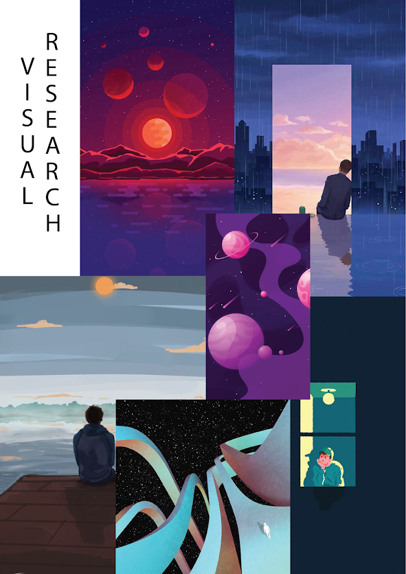 |
Figure 1.1 Visual Research
|
Idea Exploration
During the lesson, Mr. Charles informed us that we could actually make a connection between our prior project and this new one in some way. After that, I had an idea for something involving the galaxy, but I wanted to incorporate some of the features that I had drawn in Project 1. I came up with the subject, which isn't that far from my self-portrait, after some thought. It was still somewhat of the same, but I had a different vision in my head. As a result, I wanted it to do something with me once more. Because In my real life I spend a lot of time thinking about life, I wanted to create something that had me staring at the sky during the night while having a realistic dream.
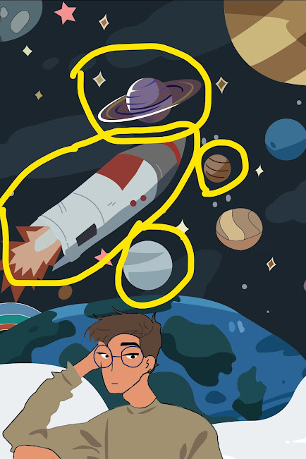 |
Figure 1.2 Elements that i want to reuse |
Final Project
Title : BELUM LAGI
RATIONALE
In this illustration, I have tried to conceptualise my view towards life through the ways I see fit. Here, I’ve depicted myself sitting on top of the world, gazing at a hole in the sky as I wander my thoughts into many different possibilities. As I sit there alone, tethered to the world below my feet, our world, I wonder about holding on to this inescapable normalcy we are all stuck in. As vast as the world appears to be, and as all-encompassing as our lives may appear to be, I am still left wondering, all alone. Looking at the skies, a vast transcendence itself filled with so much more awe than the world we are in, I see myself looking at a deep gorge bored into the far abyss.
In order to compare this design to the design created by Lisk Feng, we must first break it down into its constituent parts. Lisk Feng's artwork leans more toward the fantastical and dreamlike, whereas my work is more realistic in tone and subject matter. This is due to the fact that mine takes place on Earth, looking out into space, whereas hers takes place in space. I didn't want to utilise the brush stroke texture since it's realistic, and, to clarify further, in real life, we don't have anything like. Not also that I also like the color palette that she used in her artwork like purple, blue, baby pink and so on. So I followed her artwork color palette and implemented in mine.
REFLECTION
As a result of this assignment, I had the opportunity to study and develop a wide range of design abilities, in particular. When compared to the previous projects and exercises, this one was a little more difficult because the project is really open-ended, and the sky is the limit when it comes to discovering new available designs developed by other artists. However, with the supervision of Mr. Charles and some assistance from my classmates over the course of several weeks, I gradually became more comfortable throughout the weeks.


Comments
Post a Comment